Demo
  • HEROES & NAV

    • Hero Sections
    • Bold Heroes
    • Breadcrumbs
    • Banner Patterns
    • Floating Bars

    SOCIAL PROOF

    • Single Reviews
    • Multi Reviews
    • Multi Reviews (Alt)
    • Testimonial Sliders
    • Logo Grids
    • Stats & Counters

    CONTENT

    • Simple Post
    • Advanced Post
    • Modern Post
    • Timeline
    • Team Sections
    • Changelog
    • Careers
    • Events

    FORMS & FEEDBACK

    • CTA Sections
    • Contact Forms
    • Newsletter
    • Cookie Consent
    • Toasts

    FEATURES

    • 3 Card features
    • 4 Card Features
    • 6 Card Features
    • Feature Blocks
    • Process

    INTERACTIVE

    • Toggle Panels
    • Tabbed Sections
    • Video Lightboxes
    • Swiper Sliders
    • Vertical Sliders
    • Thumbnail Siders
    • Marquee Tickers
    • Before / After

    COMMERCE & DATA

    • Pricing Sections
    • Comparation Tables
    • Data tables

    LAYOUT

    • Footer Sections
    • Image Grids
    • Empty States
    • 404 Pages

    NAVIGATION

    • Navigation Bars

    MEDIA

    • Image Block
    • Icon Block
    • Video Block
    • Video Lightbox Block
    • Avatar Block

    DISPLAY

    • Badge Block
    • Tag Block
    • Tooltip Block
    • Card Block
    • Divider Block
    • Breadcrumb Block

    Layout

    • Grid Block
    • Flex Block
    • Absolute Box Block

    TYPOGRAPHY

    • Heading Block
    • Paragraph Block
    • List Block
    • Blockquote Block

    INTERACTIVE

    • Button Block
    • Link Button Block
    • Accordion Block
    • Tabs Block
    • Slider Block
    • Thumbnail Slider Block
    • Marquee Block
    • Before After Slider Block

    DATA & CCOMMERCE

    • Data Table Block
    • Pricing Block
    • Progress Block
    • Timeline Block

    FORMS

    • Contact Form Block

    TECH & SAAS

    • Helios
    • Tempo
    • Verso
    • Ledge Finance

    TRAVEL & LEISURE

    • Meridian
    • Traverse
    • Vela
    • Wildpath
    • Poseidon

    HOSPITALITY

    • Wineatic
    • Trattoria Sole
    • Santa Lucia

    SERVICES & DESIGN

    • Kova
    • Haven Studio
    • Volta
    • Pxlcraft
    • Apex Agency

    SPECIALITY

    • Bright Smile
    • Dentist Modern
    • Bento
  • Ecommerce
  • Docs
Websites
Patterns
HEROES & NAV
Hero SectionsBold HeroesBreadcrumbsBanner PatternsFloating Bars
SOCIAL PROOF
Single ReviewsMulti ReviewsMulti Reviews (Alt)Testimonial SlidersLogo GridsStats & Counters
CONTENT
Simple PostAdvanced PostModern PostTimelineTeam SectionsChangelogCareersEvents
FORMS & FEEDBACK
CTA SectionsContact FormsNewsletterCookie ConsentToasts
FEATURES
3 Card features4 Card Features6 Card FeaturesFeature BlocksProcess
INTERACTIVE
Toggle PanelsTabbed SectionsVideo LightboxesSwiper SlidersVertical SlidersThumbnail SidersMarquee TickersBefore / After
COMMERCE & DATA
Pricing SectionsComparation TablesData tables
LAYOUT
Footer SectionsImage GridsEmpty States404 Pages
Blocks
NAVIGATION
Navigation Bars
MEDIA
Image BlockIcon BlockVideo BlockVideo Lightbox BlockAvatar Block
DISPLAY
Badge BlockTag BlockTooltip BlockCard BlockDivider BlockBreadcrumb Block
Layout
Grid BlockFlex BlockAbsolute Box Block
TYPOGRAPHY
Heading BlockParagraph BlockList BlockBlockquote Block
INTERACTIVE
Button BlockLink Button BlockAccordion BlockTabs BlockSlider BlockThumbnail Slider BlockMarquee BlockBefore After Slider Block
DATA & CCOMMERCE
Data Table BlockPricing BlockProgress BlockTimeline Block
FORMS
Contact Form Block
Demos
TECH & SAAS
HeliosTempoVersoLedge Finance
TRAVEL & LEISURE
MeridianTraverseVelaWildpathPoseidon
HOSPITALITY
WineaticTrattoria SoleSanta Lucia
SERVICES & DESIGN
KovaHaven StudioVoltaPxlcraftApex Agency
SPECIALITY
Bright SmileDentist ModernBento
EcommerceDocs
On This Page
Timeline BlockTimeline StylesDot & LineNumbered ModeItem StylingSpacingAll Available Controls
Blocks
Grid Block
Grid Item Block
Flex Block
Absolute Block
Heading Block
Paragraph Block
List Block
Image Block
Icon Block
Video Block
Video Lightbox Block
Button Block
Accordion Block
Tabs Block
Slider Block
Slider Item Block
Thumbnail Slider
Thumbnail Slider Item
Marquee Block
Marquee Item Block
Before / After
Data Table Block
Pricing Card Block
Progress Bar Block
Timline Block
Header Block
Simple Header
Advanced Header
Advanced Header Featured
Float Header
Blog Listing Block
Separator Block
Contact Form Block
Docs

/

Timeline Block

Timeline Block

A container for chronological or step-based content. Five layout styles range from alternating center cards to numbered steps. Controls the connecting line, dots, item cards, and spacing.

CENTER STYLE PREVIEW

Research Phase

User interviews, competitive analysis, and requirements gathering.

Design Sprint

Wireframes, prototyping, and design system setup.

Development

Frontend build, API integration, and testing.

Center style: cards alternate left and right around a central line with dots.

When to use this block

  • Company history or milestones
  • Step-by-step processes or workflows
  • Project timelines and roadmaps
  • Changelog or version history

Timeline Styles

Five layout styles control how items are positioned. The selected timelineStyle is passed to children via block context.
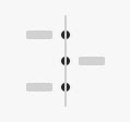
Center

Alternating L/R
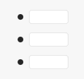
Left Cards

Bordered cards

Split

Label + dots
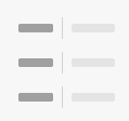
Split Label

Label + border
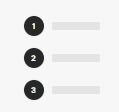
Numbered

Auto-counter

Set via timelineStyle attribute. Value is provided to child timeline-item-block blocks through block context so items adapt their layout automatically.

Dot & Line

Style the connecting line and dots that run through the timeline. Dot size is responsive across breakpoints.

Dot

Sidebar Panel

Color

#171717

Gradient

None

Size

14

px

Border Radius

50

%

Line

Sidebar Panel

Color

#E4E4E4

Gradient

None

Width

1

px

Style

solid

Dot size is responsive: Mobile Tablet Desktop — Set borderRadius to 0 for square dots, 50% for circles.

Numbered Mode

When timelineStyle is set to numbered, dots are replaced with auto-incrementing numbers using a CSS counter. No manual numbering needed.

Number Style

Numbered mode only

Number Color

#FFFFFF

Font Size

14

px

Font Weight

700

AUTO-COUNTER PREVIEW

1

First step content

2

Second step content

3

Third step content

Numbers auto-increment via counter-increment in CSS. Reordering items in the editor updates the count automatically.

Item Styling

Card appearance controls for timeline items. Most impactful in the left-cards style where items render as bordered cards.

Item Card

Sidebar Panel

Background

#FFFFFF

Border Color

#E4E4E4

Border Width

1

px

Border Radius

12

px

Item Padding

Responsive

Top

16

Right

20

Bottom

16

Left

20

Item padding is responsive: Mobile Tablet Desktop

Spacing

Control the gap between items and the outer wrapper spacing. All spacing values are responsive across breakpoints.

Item Gap

contentGap, splitGap, leftColWidth — control spacing between columns and content areas. Responsive.

Item Margin

itemMarginBottom — vertical space between each timeline item. Responsive across breakpoints.

Wrapper Spacing

Padding (all 4 sides) and margin (top/bottom) on the outer timeline container. Responsive.

Responsive: Mobile Tablet Desktop

All Available Controls

Timeline Style Layout mode selector

timelineStyle: one of center, left-cards, split, split-label, numbered. Determines the overall layout. Value is passed to child timeline-item-block via block context.

Dot Appearance Color, gradient, size, radius

dotColor: solid color for dots. dotGradient: CSS gradient string. dotSize: diameter in px (responsive — separate Mobile/Tablet/Desktop values). dotBorderRadius: percentage or px value (50% = circle, 0 = square).

Line Appearance Color, gradient, width, style

lineColor: solid color. lineGradient: CSS gradient string. lineWidth: thickness in px. lineStyle: CSS border-style value (solid, dashed, dotted).

Numbered Style Number color, size, weight

numberColor: text color for the counter number. numberFontSize: size in px. numberFontWeight: CSS font-weight (e.g. 700). Only active when timelineStyle is numbered. Numbers auto-increment via CSS counter-increment.

Item Card Styling Background, border, radius, padding

itemBackground: card background color. itemBorderColor/itemBorderWidth: card border. itemBorderRadius: corner rounding in px. itemPadding: inner spacing (responsive — Mobile/Tablet/Desktop). Most visible in left-cards style.

Spacing & Layout Gaps, margins, wrapper padding

contentGap: gap between dot/line and content. splitGap: gap between left label column and content (split styles). leftColWidth: width of the left column (responsive). itemMarginBottom: vertical space between items (responsive). Wrapper: paddingTop/Bottom/Left/Right + marginTop/Bottom (all responsive with Md/Lg variants).

Related Blocks

Tab Block

The parent container — controls tab style, colors, typography, spacing, and borders.

Accordion Block

Collapsible content sections with similar parent-child container pattern.

Brandname

Building tools that help teams move faster, ship better, and stay aligned.

Product

  • Features
  • Pricing
  • Integrations
  • Changelog

Company

  • About
  • Blog
  • Careers
  • Press

Resources

  • Documentation
  • API Reference
  • Support
  • Status

© 2026 Brandname. All rights reserved.

Privacy Policy
Terms of Service