
Absolute Box Block
An absolutely positioned container that overlays content on top of its parent. Place badges, labels, decorative elements, or floating UI anywhere with pixel-precise control — responsive across breakpoints.
WHAT IT CREATES
-20%
The Absolute Box (dark badge) is positioned over its parent Grid Item (the card). You control exactly where it sits using top, right, bottom, left offsets.
Parent must have position: relative — Grid Item always does.
When to use this block
- Discount badges, "New" labels, or status indicators on cards
- Decorative elements positioned behind or in front of content
- Floating call-to-action buttons pinned to a corner
- Overlapping layouts where elements stack on the Z axis
Position Offsets
Place the box precisely using top, right, bottom, and left values. Each offset has its own unit selector and works independently across breakpoints.
Position
Sidebar Panel
Top
Right
Bottom
Left
Z-Index
RESULT
top: 16px, right: 16px
Parent (Grid Item)
Units: Each offset supports px, %, or rem. Choose the unit from the dropdown next to each value. The unit applies per-breakpoint — you can use px on mobile and % on desktop.
RESPONSIVE POSITIONING
Mobile
top: 8px
Centered top
Tablet
top: 12, right: 12
Top-right corner
Desktop
top: -8, right: -8
Overflows parent
Negative values work too — push the element outside its parent's bounds.
Mobile Behavior
By default, the Absolute Box is relative on mobile and only becomes absolutely positioned on tablet and up. This prevents overlapping content on small screens.
DEFAULT
absoluteOnMobile: false
Mobile — position: relative
Badge (stacks in flow)
Tablet+ — position: absolute
Badge
OVERRIDE
absoluteOnMobile: true
Mobile — position: absolute
Badge
Tablet+ — position: absolute
Badge
Mobile Position
Absolute on Mobile

Keep this off (default) for badges and labels — they'll stack naturally on mobile instead of covering content. Turn it on for decorative elements that should always overlay.
Z-Index & Layering
Control which elements appear in front. Higher z-index values sit on top. Responsive across breakpoints.
Z-index
Sidebar Panel
LAYERING
Background element (z-index: 0)
Content (z-index: 1)
Badge (z-index: 10)
Background
Solid color or CSS gradient. Gradient overrides color when both are set.
Background
Color
Gradient
None
No background image on this block. For image backgrounds, use the parent Grid Item instead.
Spacing
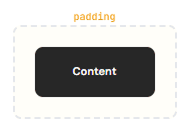
Padding (inner space) and margin in pixels. All responsive across mobile, tablet, and desktop.
Responsive:
Mobile
Tablet
Desktop
Border & Shadow
Per-side borders, per-corner radius, and shadow presets. All responsive. Same system as Grid Item Block.
Border
Width, color per side. Choose which sides get borders. Responsive across mobile, tablet, desktop.
Radius & Shadow
Per-corner radius. Shadow presets: sm, base, md, lg, xl, 2xl, inner.
Max Width
Constrain the box's maximum width using Tailwind tokens. Useful for limiting badge or overlay width.
Max Width
Sidebar Panel
Max Width
Uses Tailwind width tokens (e.g. sm = 24rem, md = 28rem, 7xl = 80rem). Leave empty for no constraint.
All Available Controls
Position Offsets top, right, bottom, left — 3 breakpoints

posTop, posRight, posBottom, posLeft (+Md/Lg). Unit: posUnit (+Md/Lg) — px, %, or rem. Negative values are supported.
Z-Index Layering order — 3 breakpoints
zIndex (+Md/Lg). Any numeric value. Higher numbers appear in front. Set to layer above sibling content.
Mobile Position absoluteOnMobile toggle
absoluteOnMobile: false (default) — relative on mobile, absolute on tablet+. true — absolute on all breakpoints.
Background Color or gradient (no image)
backgroundColor (hex), backgroundGradient (CSS gradient, overrides color). No image support.
Spacing Padding & margin, 3 breakpoints
Padding/Margin: top, bottom, left, right in px. Responsive: mobile, Md, Lg. Margin declarations use !important.
Border & Shadow Per-side, per-corner, shadow presets
Border: borderMobile/Tablet/Desktop + borderSides/borderSidesMd/borderSidesLg. Radius: borderRadiusMobile/Tablet/Desktop (per-corner). Shadow: sm–2xl, inner. Shadow is mutually exclusive with border — shadow wins if both set.
Max Width Tailwind token constraint
maxWidth: Tailwind max-width token (e.g. sm, md, lg, 7xl). Applied as !max-w-{token} class.