
Thumbnail Slider Item
An individual slide inside a Thumbnail Slider. Upload an image, add optional caption text (top title, main title, body), and choose text alignment. The block also embeds thumbnail data used to build the strip.
SLIDE ANATOMY

Top title, title, and body text all overlay the image behind a gradient — this single slide is a thumbnail-slider-item-block configured with every caption field on
Leaf block — no inner blocks
Unlike Slider Item Block, this is a leaf block. Content is configured entirely through sidebar attributes (image upload + text fields), not by adding blocks inside.
Slide Image
Upload the main slide image from the media library. Responsive srcset and sizes are auto-generated. Images are lazy-loaded.
Image
Sidebar Panel
Image
Alt Text
The same image URL is also used for the thumbnail strip (data-thumb-url). The slide still renders without an image, just with no <img> tag.
Caption
Three optional text fields overlay the slide image. Each has its own toggle, text, and color. Enable the gradient overlay for better readability on light images.
Caption
Sidebar Panel
Show Top Title

Top Title
Featured
Show Title
Title
Headphones
Show Text

Gradient
Text Align
CAPTION VARIATIONS
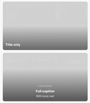
Gradient overlay adds a dark-to-transparent gradient behind the caption text. Renders as a separate <div> inside the caption wrapper.
Thumbnail Data
Each slide embeds a hidden <span> with data attributes that JavaScript reads to build the thumbnail strip. You don’t configure this directly — it’s generated automatically.
HOW THUMBNAILS ARE BUILT
1. Slide saves data
data-thumb-url="photo.jpg"
data-thumb-label="Wireless"
2. JS reads it
view.js finds all .tsb-thumb-data spans and extracts the URL and label.
3. Strip is built
Thumbnail images are created dynamically in the empty .tsb-thumb-swiper wrapper.
The thumb label is the first word of the title (or body text / top title as fallback, in that priority order). It may appear as a caption in the thumbnail strip depending on the theme’s CSS.
All Available Controls
Image Upload, alt text, auto srcset

imageUrl/imageAlt. imageSrcset/imageSizes auto-generated on upload (same pattern as image-block). Images are lazy-loaded. Also used as data-thumb-url for the thumbnail strip — independent of whether the main <img> rendered.
Top Title Small label above the main title
showTopTitle: toggle. topTitle: text. topTitleColor: hex, omitted if not set. Renders as <span class="tsb-top-title"> — both showTopTitle AND a non-empty topTitle are required for it to render.
Title Main slide heading
showTitle: toggle. title: text. titleColor: hex. Renders as <h3 class="tsb-title">. First word becomes the data-thumb-label used in the thumbnail strip — takes priority over body text and top title as the label source.
Body Text Description below the title
showText: toggle. text: body content. textColor: hex. Renders as <p class="tsb-text">. Used as the thumb-label fallback when title is empty.
Gradient & Alignment Caption overlay + text-align
captionGradient: toggle. Adds a dark gradient overlay behind caption text. textAlign: "left" (default), "center", "right". Applied to the .tsb-caption wrapper.