
Flex Block
A flexible layout container using CSS Flexbox. Arrange child blocks in rows or columns with full control over direction, wrapping, alignment, and spacing — all responsive across breakpoints.
WHAT IT CREATES
Row (horizontal)
A
B
C
Column (vertical)
A
B
C
When to use this block
- Horizontal rows of elements (icon + text, buttons side by side)
- Vertical stacking with controlled spacing inside a Grid Item
- Centering content (horizontally, vertically, or both)
- Responsive layouts that switch from row to column on mobile
Direction
Controls whether children flow horizontally (row) or vertically (column). Set different directions per breakpoint.
Direction
Sidebar Panel
RESULT
Mobile — column
Tablet+ — row
Common pattern: flexDirection: "col" on mobile, flexDirectionMd: "row" on tablet — items stack vertically on small screens, sit side-by-side on larger ones.
Options: row, row-reverse, col (column), col-reverse. Default: row.
Alignment
Control how children are positioned along both axes. Responsive across 3 breakpoints.
Justify Content
Main axis
start
center
end
between
around
evenly
Align Items
Cross axis
start
center
end
Both controls are responsive: set different values for mobile, tablet (Md), and desktop (Lg).
Wrap
Controls whether children wrap to the next line when they don't fit in one row.
No Wrap
Items shrink or overflow
Wrap
Items flow to next line
Wrap Reverse
Wraps upward
Gap
Space between children. Separate controls for horizontal (X) and vertical (Y) gaps.
Gap
Sidebar Panel
Gap X (horizontal)
Gap Y (vertical)
SCALE
0
0px
2
8px
4
16px
6
24px
8
32px
10
40px
12
48px
16
64px
Responsive: gapXMd, gapXLg, gapYMd, gapYLg for tablet and desktop.
Background
Solid color or CSS gradient. No background image support on this block — use a Grid Block or Grid Item for image backgrounds.
Background
Color
Gradient
None
Spacing
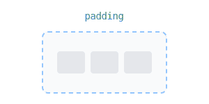
Padding and margin in pixels. Responsive across mobile, tablet, and desktop.
Responsive:
Mobile
Tablet
Desktop
Border & Shadow
Per-side borders, per-corner radius, and shadow presets. All responsive. Same system as Grid Block.
Border
Width, color, style per side. Responsive across mobile, tablet, desktop.
Radius & Shadow
Per-corner radius. Shadow: sm, base, md, lg, xl, 2xl, inner.
All Available Controls
Direction row, col, reverse — 3 breakpoints

flexDirection (mobile), flexDirectionMd, flexDirectionLg. Values: row, row-reverse, col, col-reverse. Default: row.
Wrap wrap, nowrap, wrap-reverse — 3 breakpoints
flexWrap, flexWrapMd, flexWrapLg. Values: wrap, nowrap, wrap-reverse.
Alignment justify + align — 3 breakpoints each
Justify: justifyContent (+Md/Lg) — start, center, end, between, around, evenly.
Align: alignItems (+Md/Lg) — start, center, end, stretch, baseline.
Gap X & Y — 0–16 scale, 3 breakpoints
gapX / gapY (+Md/Lg). Scale: 0, 1, 2, 3, 4, 5, 6, 8, 10, 12, 16.
Background Color or gradient (no image)
backgroundColor (hex), backgroundGradient (CSS gradient, overrides color). No image support.
Spacing Padding & margin, 3 breakpoints
Padding/Margin: top, bottom, left, right in px. Responsive: mobile, Md, Lg.
Border & Shadow Per-side, per-corner, shadow presets
Border: borderMobile/Tablet/Desktop + borderSides. Radius: borderRadiusMobile/Tablet/Desktop. Shadow: sm–2xl, inner.