
/
/
Heading Block
P
Paragraph Block
Body text rendered as a <p> tag. Same typography controls as the Heading Block — font size, weight, line height, letter spacing, color, and alignment — all responsive.
HEADING LEVELS
Hero subtitle
A complete block library built for speed, flexibility, and pixel-perfect control.
Section description
Every block is responsive out of the box. Set different values for mobile, tablet, and desktop — no custom CSS needed.
Small caption
Built with performance in mind. Zero JavaScript, pure CSS output.
When to use this block
- Body copy, descriptions, subtitles, captions
- Any text that isn’t a heading or list item
- Supports bold, italic, and links inside the text
Typography
Font size, line height, and letter spacing — all in pixels, all responsive across 3 breakpoints.
Typography
Sidebar Panel
Font Size
px
Line Height
px
Letter Spacing
px
RESPONSIVE EXAMPLE
Mobile
14px / 22px
Responsive text that scales up on larger screens.
Tablet
15px / 24px
Responsive text that scales up on larger screens.
Desktop
16px / 26px
Responsive text that scales up on larger screens.
All values in px only. No em, rem, or unitless values. Enter the number only — the block adds px automatically.
Weight & Color
Font weight is chosen from the block toolbar. Text color uses a hex color picker in the sidebar.
Font Weight
Block Toolbar
Light
300
Normal
400
Medium
500
Semi-Bold
600
Bold
700
Extra-Bold
800
6 weights (300–800). Heading Block has 7 (adds 900).
Text Color
Sidebar Panel
Color
COMMON CHOICES
#171717
#525252
#717171
#FFFFFF
Text Alignment
Align text using the standard WordPress alignment toolbar.
Left
Build faster with blocks.
Center
Build faster with blocks.
Right
Build faster with blocks.
Justify
Build faster with blocks and patterns.
Inline Formatting
The heading content supports rich text formatting. Select text within the heading to apply bold, italic, or links.
EXAMPLES
Our blocks give you full control over every detail — from spacing and typography to responsive breakpoints.
Italic word for emphasis
Read the getting started guide to learn how blocks work together.
Inline link within heading
Spacing
Padding and margin in pixels. Responsive across mobile, tablet, and desktop.
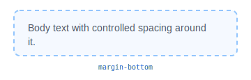
Responsive:
Mobile
Tablet
Desktop
No border, background, or shadow on this block. Wrap it in a Grid Item or Flex Block if you need those.
All Available Controls
Font Size px — 3 breakpoints

fontSize, fontSizeMd, fontSizeLg. Value in px (number string, e.g. "16").
Line Height px — 3 breakpoints
lineHeight, lineHeightMd, lineHeightLg. Value in px only — never unitless or em.
Letter Spacing px — 3 breakpoints
letterSpacing, letterSpacingMd, letterSpacingLg. Value in px only — never em.
Font Weight 300–800, toolbar dropdown
fontWeight: 300 (Light), 400 (Normal), 500 (Medium), 600 (Semi-Bold), 700 (Bold), 800 (Extra-Bold). 6 values total.
Text Color Hex color
textColor: hex string (e.g. "#171717"). Applied as inline style="color:...".
Text Alignment left, center, right, justify
textAlign: left, center, right, justify. Via WordPress core alignment toolbar.
Spacing Padding & margin, 3 breakpoints
Padding/Margin: top, bottom, left, right in px. Responsive: mobile, Md, Lg. Margin gets !important.