Demo
  • HEROES & NAV

    • Hero Sections
    • Bold Heroes
    • Breadcrumbs
    • Banner Patterns
    • Floating Bars

    SOCIAL PROOF

    • Single Reviews
    • Multi Reviews
    • Multi Reviews (Alt)
    • Testimonial Sliders
    • Logo Grids
    • Stats & Counters

    CONTENT

    • Simple Post
    • Advanced Post
    • Modern Post
    • Timeline
    • Team Sections
    • Changelog
    • Careers
    • Events

    FORMS & FEEDBACK

    • CTA Sections
    • Contact Forms
    • Newsletter
    • Cookie Consent
    • Toasts

    FEATURES

    • 3 Card features
    • 4 Card Features
    • 6 Card Features
    • Feature Blocks
    • Process

    INTERACTIVE

    • Toggle Panels
    • Tabbed Sections
    • Video Lightboxes
    • Swiper Sliders
    • Vertical Sliders
    • Thumbnail Siders
    • Marquee Tickers
    • Before / After

    COMMERCE & DATA

    • Pricing Sections
    • Comparation Tables
    • Data tables

    LAYOUT

    • Footer Sections
    • Image Grids
    • Empty States
    • 404 Pages

    NAVIGATION

    • Navigation Bars

    MEDIA

    • Image Block
    • Icon Block
    • Video Block
    • Video Lightbox Block
    • Avatar Block

    DISPLAY

    • Badge Block
    • Tag Block
    • Tooltip Block
    • Card Block
    • Divider Block
    • Breadcrumb Block

    Layout

    • Grid Block
    • Flex Block
    • Absolute Box Block

    TYPOGRAPHY

    • Heading Block
    • Paragraph Block
    • List Block
    • Blockquote Block

    INTERACTIVE

    • Button Block
    • Link Button Block
    • Accordion Block
    • Tabs Block
    • Slider Block
    • Thumbnail Slider Block
    • Marquee Block
    • Before After Slider Block

    DATA & CCOMMERCE

    • Data Table Block
    • Pricing Block
    • Progress Block
    • Timeline Block

    FORMS

    • Contact Form Block

    TECH & SAAS

    • Helios
    • Tempo
    • Verso
    • Ledge Finance

    TRAVEL & LEISURE

    • Meridian
    • Traverse
    • Vela
    • Wildpath
    • Poseidon

    HOSPITALITY

    • Wineatic
    • Trattoria Sole
    • Santa Lucia

    SERVICES & DESIGN

    • Kova
    • Haven Studio
    • Volta
    • Pxlcraft
    • Apex Agency

    SPECIALITY

    • Bright Smile
    • Dentist Modern
    • Bento
  • Ecommerce
  • Docs
Websites
Patterns
HEROES & NAV
Hero SectionsBold HeroesBreadcrumbsBanner PatternsFloating Bars
SOCIAL PROOF
Single ReviewsMulti ReviewsMulti Reviews (Alt)Testimonial SlidersLogo GridsStats & Counters
CONTENT
Simple PostAdvanced PostModern PostTimelineTeam SectionsChangelogCareersEvents
FORMS & FEEDBACK
CTA SectionsContact FormsNewsletterCookie ConsentToasts
FEATURES
3 Card features4 Card Features6 Card FeaturesFeature BlocksProcess
INTERACTIVE
Toggle PanelsTabbed SectionsVideo LightboxesSwiper SlidersVertical SlidersThumbnail SidersMarquee TickersBefore / After
COMMERCE & DATA
Pricing SectionsComparation TablesData tables
LAYOUT
Footer SectionsImage GridsEmpty States404 Pages
Blocks
NAVIGATION
Navigation Bars
MEDIA
Image BlockIcon BlockVideo BlockVideo Lightbox BlockAvatar Block
DISPLAY
Badge BlockTag BlockTooltip BlockCard BlockDivider BlockBreadcrumb Block
Layout
Grid BlockFlex BlockAbsolute Box Block
TYPOGRAPHY
Heading BlockParagraph BlockList BlockBlockquote Block
INTERACTIVE
Button BlockLink Button BlockAccordion BlockTabs BlockSlider BlockThumbnail Slider BlockMarquee BlockBefore After Slider Block
DATA & CCOMMERCE
Data Table BlockPricing BlockProgress BlockTimeline Block
FORMS
Contact Form Block
Demos
TECH & SAAS
HeliosTempoVersoLedge Finance
TRAVEL & LEISURE
MeridianTraverseVelaWildpathPoseidon
HOSPITALITY
WineaticTrattoria SoleSanta Lucia
SERVICES & DESIGN
KovaHaven StudioVoltaPxlcraftApex Agency
SPECIALITY
Bright SmileDentist ModernBento
EcommerceDocs
On This Page
Thumbnail SliderThumbnail PositionThumbnail SettingsBorder RadiusSlide CounterNavigation & PlaybackBackground & WidthSpacingAll Available Controls
Blocks
Grid Block
Grid Item Block
Flex Block
Absolute Block
Heading Block
Paragraph Block
List Block
Image Block
Icon Block
Video Block
Video Lightbox Block
Button Block
Accordion Block
Tabs Block
Slider Block
Slider Item Block
Thumbnail Slider
Thumbnail Slider Item
Marquee Block
Marquee Item Block
Before / After
Data Table Block
Pricing Card Block
Progress Bar Block
Timline Block
Header Block
Simple Header
Advanced Header
Advanced Header Featured
Float Header
Blog Listing Block
Separator Block
Contact Form Block
Docs

/

Thumbnail Slider

Thumbnail Slider

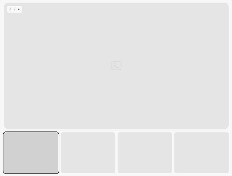
A dual slider with a synchronized thumbnail strip. Click a thumbnail to jump to that slide. Supports below, left (vertical), and filmstrip layouts. Each slide is a Thumbnail Slider Item.

PREVIEW
thumbnail slider

Click a thumbnail to jump to that slide — the strip is built at runtime by view.js from each slide's .tsb-thumb-data

When to use this block

  • Product image galleries with thumbnail navigation
  • Portfolio showcases with preview strips
  • Before/after comparisons, case studies
  • Any slider where users need to jump to a specific slide

Thumbnail Position

Choose where the thumbnail strip appears relative to the main slider.

Below

default thumbnail

Default layout

Left

left position thumbnails

Vertical strip

Filmstrip

film strip

Tighter, no gaps

Thumbnail Settings

Control how many thumbnails are visible, the gap between them, and the active highlight color.

Thumbnails

Sidebar Panel

Visible

0 (auto)

Gap

8

px

Active Color

#171717

ACTIVE HIGHLIGHT

Set thumbsVisible: 0 to let Swiper auto-calculate based on available space. Or set a fixed number (e.g. 4 or 6).

Border Radius

Separate radius controls for the main slide and thumbnails. Applied via CSS custom properties.

Radius

Sidebar Panel

Main Slide

16

px

Thumbnails

8

px

VISUAL

16px radius

8px radius on thumbs

Slide Counter

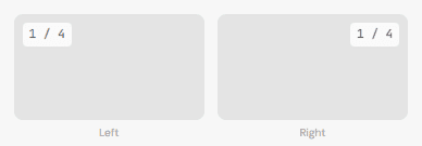
Show a “1 / 4” counter overlay. Position it left or right. Customize the text color.

Counter

Sidebar Panel

Show Counter

Color

#FFFFFF

Position

Left
Right

COUNTER POSITIONS

Navigation & Playback

Arrow buttons (inside the slider or outside top-right), autoplay, loop, and transition settings.

Navigation

Sidebar Panel

Show Arrows

Show on Mobile

Arrow Position

Inside

Custom Icon

None

Playback

Effect

Slide

Autoplay

Delay

3000

ms

Loop

Speed

500

ms

Height Mode

Equal

Arrow positions: inside places arrows within the main slide area. outside-top-right places them in a header row above the slider (next to the counter if enabled).

Background & Width

Optional background color or gradient. Control max-width or set to full-width.

Background

Solid color or gradient on the outer wrapper. Gradient overrides color.

Max Width

Tailwind token (sm–7xl) or full-width toggle. Auto-centered.

Spacing

Padding (all 4 sides) and margin. Responsive across breakpoints.

Responsive: Mobile Tablet Desktop

All Available Controls

Thumbnail Position Below, left, filmstrip

thumbPosition: "below" (default), "left" (vertical strip), "filmstrip" (tight strip). Controls layout order — left renders thumbs before the main slider inside .tsb-layout.

Thumbnail Settings Visible count, gap, active color

thumbsVisible: number (0 = auto, lets Swiper auto-calculate). thumbGap: px (default 8). thumbActiveColor: hex highlight color for the active thumbnail — only rendered as a CSS var when non-empty, unlike the two radius vars below which always render.

Border Radius Main slide + thumbnail radius

mainBorderRadius (default 16px), thumbBorderRadius (default 8px). Always rendered as CSS custom properties --tsb-main-radius / --tsb-thumb-radius on the wrapper — never omitted, falls back to 0px if falsy rather than being skipped.

Slide Counter Toggle, color, position

showCounter: toggle. counterColor: hex. counterPosition: "left" or "right". Displays as “1 / N” format, updated by JS on slide change

Navigation & Playback Arrows, effect, autoplay, loop, speed

navigation/navigationMobile: arrow toggles. arrowPosition: "inside" or "outside-top-right". arrowIconUrl: custom icon. sliderEffect: slide/fade/coverflow. autoplay/autoplayDelay/loop/speed. heightMode: "equal" or "auto"

Background & Spacing Color/gradient, max-width, padding, margin

backgroundColor/backgroundGradient. maxWidth/isFullWidth. Padding: paddingTop/Bottom/Left/Right (+Md/Lg). Margin: marginMobile/Tablet/Desktop (objects).

Related Blocks

Thumbnail Slider Item

Individual slide with image, title, caption, and thumbnail data.

Slider Block

Standard carousel without thumbnails — for content/card sliders.

Brandname

Building tools that help teams move faster, ship better, and stay aligned.

Product

  • Features
  • Pricing
  • Integrations
  • Changelog

Company

  • About
  • Blog
  • Careers
  • Press

Resources

  • Documentation
  • API Reference
  • Support
  • Status

© 2026 Brandname. All rights reserved.

Privacy Policy
Terms of Service